Getting more traffic feels like progress.
And usually it is.
But there comes a point where the more important question becomes:
What happens when people actually arrive?
A website can attract hundreds or thousands of visitors and still generate surprisingly little business.
When that happens, the problem may not be traffic.
It may be conversion.
Traffic is not the same as enquiries
Imagine 1,000 people walking into a physical shop.
If nobody buys anything, the solution probably isn't simply to get another 1,000 people through the door.
You would first want to understand why the existing visitors aren't buying.
Websites are no different.
Before spending more money on SEO or advertising, it can be worth understanding what visitors are experiencing.
Your message isn't immediately clear
A visitor should not need to study your website to understand what you do.
Your homepage should quickly communicate:
- what you provide
- who it is for
- why it matters
- what the visitor should do next
Businesses sometimes use vague headlines because they sound sophisticated.
Clarity normally performs better.
"Transforming tomorrow through innovative solutions" tells the customer very little.
"Mobile physiotherapy across Greater Manchester" immediately tells them what the service is.
Visitors don't trust you yet
Before contacting an unfamiliar business, people look for reassurance.
Depending on the industry, that may include:
- reviews
- qualifications
- accreditations
- examples of work
- case studies
- transparent pricing
- photographs
- genuine team information
- clear contact details
If your website makes big claims but provides very little evidence, customers may continue searching.
Your calls to action are too weak
Every important page should help the visitor understand what to do next.
That might be:
- Request a Quote
- Book a Consultation
- Check Availability
- Call Us
- Start Your Project
- View Pricing
A generic "Learn More" button is sometimes appropriate.
But if every button simply sends users to another information page, they can end up endlessly browsing without being encouraged to act.
The website is difficult to use
Poor usability quietly destroys conversions.
Problems might include:
- confusing menus
- long blocks of text
- tiny buttons
- intrusive pop-ups
- broken mobile layouts
- excessive animation
- hidden contact information
- slow pages
Good website design should reduce friction.
It should not create more of it.
Your contact form asks for too much
Businesses naturally want as much information as possible from a new lead.
Customers often want to provide as little information as possible.
There is a balance.
If someone simply wants to ask a question, forcing them to complete 15 fields may significantly reduce enquiries.
Ask for what you genuinely need at that stage.
More information can always be collected later.
You are attracting the wrong traffic
Not every SEO ranking or advertising click is valuable.
A website may receive increasing traffic because it ranks for searches that have little commercial relevance.
For example, an article may attract thousands of people looking for general information while a service page attracts only a small number of visitors who actually want to buy.
This is why traffic figures need context.
Ten highly relevant visitors may be more valuable than 1,000 irrelevant ones.
Your website doesn't answer the buyer's questions
Potential customers often arrive with concerns.
They may want to know:
- How much does it cost?
- How does the process work?
- How long does it take?
- Who will I deal with?
- What happens next?
- What experience do you have?
- Are there examples?
- What happens if I need support?
If the website avoids all these questions, the customer may simply go somewhere that answers them.
You're making people work too hard
Good websites reduce uncertainty.
Poor websites require visitors to piece information together themselves.
Don't make someone visit six different pages just to understand a basic service.
Structure the website around the customer's decision-making process rather than the company's internal organisation.
How do you improve website conversions?
Start by reviewing the basics.
Clarify your proposition
Make it obvious what you do.
Strengthen proof
Use genuine evidence wherever possible.
Improve calls to action
Tell people what the next step is.
Simplify navigation
Remove unnecessary choices.
Improve mobile experience
Test the site on an actual phone.
Review forms
Remove unnecessary friction.
Measure what happens
Use analytics and conversion tracking so you can understand how visitors behave.
When is a redesign the better option?
Sometimes conversion problems can be improved within the existing website.
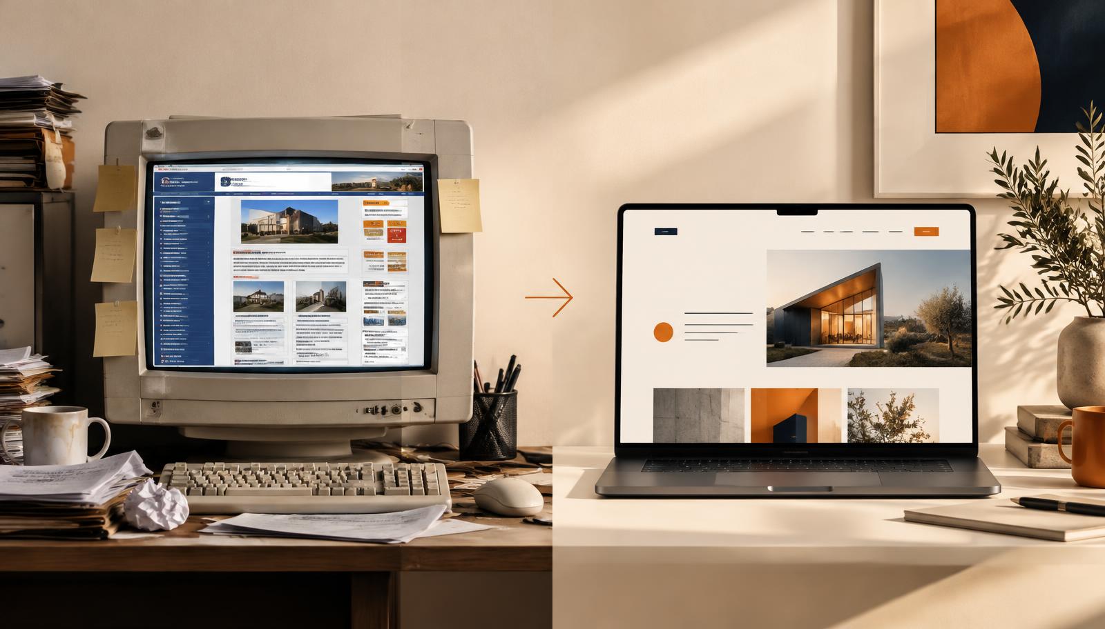
Sometimes the problems are so deeply embedded in the site's structure that rebuilding is more efficient.
If the site:
- looks dated
- performs poorly on mobile
- has confusing navigation
- is technically difficult to change
- no longer reflects the business
then a redesign may be worth considering.
You can also view examples of our work here.
Final thoughts
A website does not need huge amounts of traffic to be commercially useful.
It needs the right people to arrive and feel confident enough to take the next step.
If you're already getting visitors, don't automatically assume you need more.
First make sure the website is doing everything it can with the traffic you already have.
Frequently Asked Questions
What is a good website conversion rate?
There is no universal figure because conversion rates vary significantly by industry, traffic source, offer and type of conversion.
Does more traffic mean more enquiries?
Not necessarily. Relevant traffic and a strong website experience are more important than traffic volume alone.
Can website design affect enquiries?
Yes. Clarity, trust, speed, usability and calls to action can all influence whether a visitor decides to contact a business.
Should I advertise if my website doesn't convert?
Advertising may generate traffic, but fixing major website conversion problems first can make that traffic considerably more valuable.